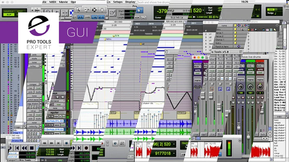
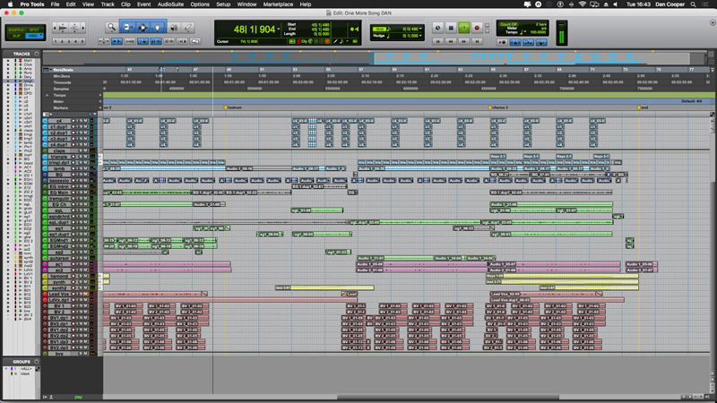
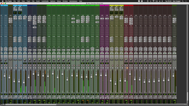
The look, feel and overall layout of the Pro Tools user interface hasn’t really changed that much over the years. Take a close look at both the images below. One is of Pro Tools 5 from around 2002, the other is of Pro Tools today in 2019. Apart from the obvious advances in graphics technology clearly separating the two versions there really isn’t that much between these user interfaces in terms of general design, layout and form factor.


Many will say that this is no bad thing, that it is indeed this familiarity that makes Pro Tools special but what if Pro Tools got a UI refresh? Would you embrace it or run for the hills?
New Pro Tools features over the years have forced a number UI changes here and there but as you can see from these 2 images Pro Tools is pretty much the same application it was over 15 years ago.
If the look and feel of Pro Tools were to change one day would it be detrimental to the core of the application? Is this familiarity that Avid has retained in Pro Tools been a feature we all demand from Pro Tools?
There are so many questions that can be raised from this topic which we cannot answer as it’s all speculation so to help pick this apart we have discussed this within the Production Expert team to get a sense of how users might feel if Pro Tools was to one day get a UI refresh. As you would expect we have some very different opinions on this. How would we feel if the Pro Tools UI changed? If we liked this idea then what sort of changes would we like to see and why?
Mike - No Change
When I saw these two images above side by side, I was very surprised how little the Pro Tools graphical user interface has changed. Yes the graphics have improved as the graphics performance in computers have improved, but the basic format and layout are virtually unchanged and I, for one, am very glad it is. Let me explain why.
If you are like me and are a Pro Tools user who depends on a lot of muscle memory, both on keyboard shortcuts and using a mouse around the Pro Tools GUI, the last thing we want are wholesale changes to the GUI. Move anything or change a shortcut and my well oiled workflows get the hiccups, or even worse, seize up completely.
I have been a ‘two screen’ guy right from the beginning when Macs could support a second screen. Since then I have the Edit window on mainly on the left screen with the Clip List set to be on the right hand screen and then the Mix window and plug-ins on the right hand window. I find the 2 screen way of working on Pro Tools very useful and gives me what I need to see with the minimum of clicking and opening and closing windows.
So I would ask the Avid developers to think very carefully before tinkering with the Pro Tools GUI.
That said, the progressively increasing screen resolutions means that elements of the Pro Tools GUI have got progressively smaller as the screen resolutions have got bigger. For example, if you have a 21” screen that is at 1280x720, the Play button will be bigger on the screen than a 21” screen set at 1920x1080 resolution. So maybe there is something that needs to be done to resolve how the Pro Tools GUI looks on screens especially now we have 4K screens as if Avid do nothing that Play button is going to be minute.
Russ - Studio One Window Experience, one window workflow
To be honest I’ve never really had a problem with the Pro Tools user interface, the two window approach has always been a straightforward workflow. With that said, I jump between Pro Tools and Studio One and so I’m spoilt by a user interface that’s fit for modern workflows like small laptop screens as well as Retina and 4K monitors.
Studio One offers the best of both worlds, a single screen interface as well as the ability to undock stuff if one wants that so it can offer me a ‘Pro Tools experience’ if I want it.
They say a picture paints a thousand words, so here’s a short video to show just how powerful the Studio One user interface is. It does make one feel restricted when using the Pro Tools interface, particularly when working on a laptop… which for a lot of modern music makers is their weapon of choice.
Dan - Open To Change If Options Are Left Open
I’ve felt for a number of years that the Pro Tools UI has been in need of a bit of an overhaul. Part of me, feels that it’s user interface is Pro Tools’ main redeeming feature as it is indeed a very familiar place to work in but I can’t shake the feeling that it is this familiarity that has held Pro Tools back in terms of development compared to other popular DAWs. What I would like to see if Avid did overhaul Pro Tools is for Avid to offer a single window layout option. This would do away with current separate floating windows such as independent Mix and Edit windows. While I believe this would be a very cool option to have there should be a preference which keeps the door open for long time users of Pro Tools to be able to chose to use Pro Tools in it’s current classic format. Single window apps have been becoming more the norm over recent years. Such apps include Studio One, Logic Pro X, Final Cut X to name a few. With a single window interface I would also like to see a set of new preferences that would enable us to scale parts of the UI to taste. For instance, instead of having two options for track width in the mixer window I’d like to see a percentage scale that would enable us to choose our own custom track widths as this would enable us to see more text info in the channel name, inserts and sends banks while also making good use of whatever sized screen real-estate we have.
Like other DAWs, a dockable mix window would also be a great addition as well. This could stick to the bottom of the one window which would do away with having to switch between two floating windows.
The Future Of Pro Tools User Interface
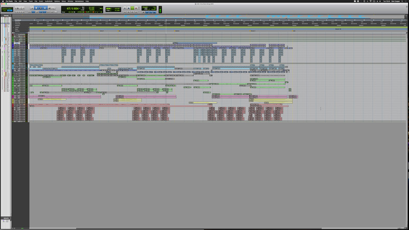
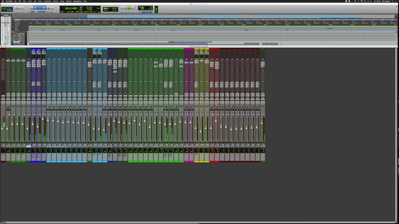
One thing is for sure, Pro Tools is being left behind in the screen resolution department, which Mike has alluded to already. I think Avid has a fantastic opportunity to not only address the 4K elephant in the room but to also take a look at how other developers employ a single window format such as Studio One. 4K has been around for some time now with most of the off-the-shelf computer displays and indeed all-in-one computers such the iMac supporting 4k, but Pro Tools in its current form does not translate on higher resolutions at all as you can see from the images above. Despite having a large display for the UI you would need a magnifying glass in order to see anything.
Over To You
There you have it, we have laid out the options, but what do you think? Do share your thoughts, observations and experiences in the comments below and vote in this simple poll.