
In this article Julian considers the conflicting jobs a plugin UI has to fulfil and what is it that really matters in a user interface.
Why Do Plugins Look The Way They Do?
We occasionally see images online of long forgotten versions of software which look hilariously clunky compared to their modern counterparts. However you need only look at any familiar DAW which has been around long enough to have a properly vintage version to see that well designed user interfaces tend to persist over time. Considering how much of the time mixers in particular spend choosing and using plugins it's interesting to consider what makes a plug-in user interface successful, practical and useful.
The very earliest plug-ins were extensions of the computer graphical user interface of the time. The story of how early GUIs were developed at Xerox at Palo Alto and how this came to become widespread in computers is well documented but fundamentally the task of these was to create something visually meaningful which could easily be controlled using a pointing device like a mouse. These elements are still with us today and if you open something like the Strip Silence or Beat Detective windows in Pro Tools you'll see radio buttons text boxes and sliders all of which are ideally suited to use with a mouse, something which can't be said of many of the UI elements found in some contemporary plug-ins.
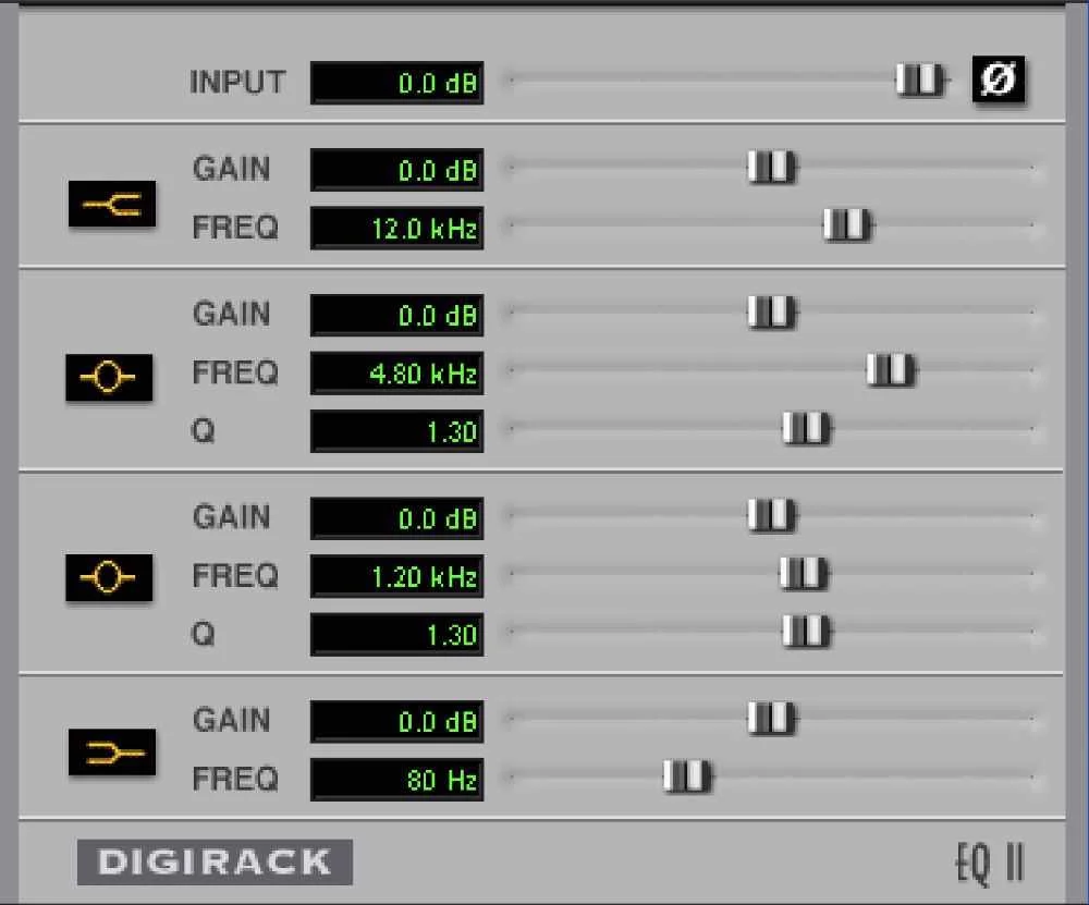
EQ II, How Plugins Used To Be
Two schools of thought developed in parallel early on in the emerging plug-in market. Waves were famously in at the ground floor when it comes to the development of third-party plug-ins and in the Q10 EQ you can see the rich visual feedback which made this plugin as useable as it was. The presence of a graph displaying the combined response of all the filters is something we take for granted now. This type of visual feedback allows the state of an EQ to be assessed at a glance, something which couldn’t be done with something like the Digidesign EQ II pictured above. Add the ability to manipulate the curve directly and you have a winning combination.
Skeuomorphic Plugins
The second school of thought when it came to plugin design is the much debated use of skeuomorphism. Making plugins look like the hardware they emulate adds desirability and influences the users perception of the plugin, whether we like to admit it or not. However it is rightly criticised for compromising the user experience. Physical knobs are convenient to use but rotary controls make little sense when controlling them with a mouse.
But the fact remains that skeuomorphic designs are popular and the success of the early Bomb Factory plugins are testament to this.
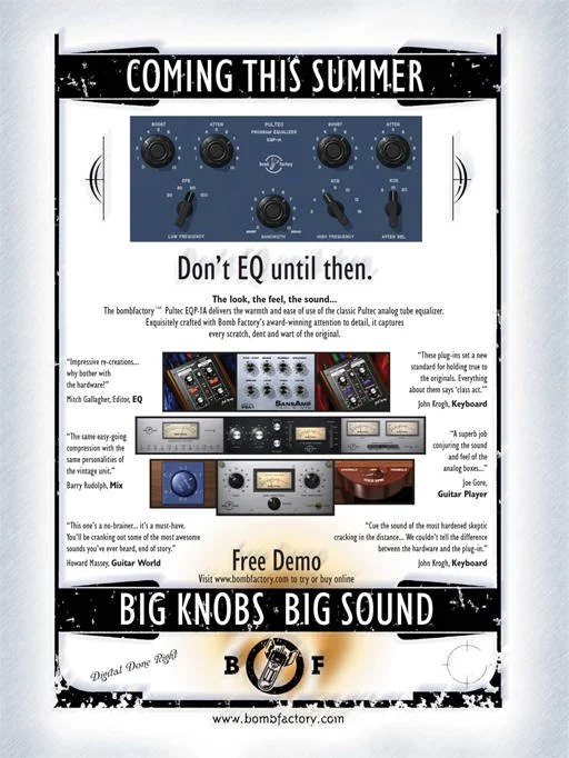
Bomb Factory Ad Circa 2000
The strict conformity to the way the original hardware functioned is another area of debate. How many people have been left bewildered by the backwards attack and release controls on an 1176 plugin? But it is heresy to reverse it!
Why Does Hardware Look The Way It Does?
But why do Skeuomorphic designs look the way they do? Because that’s how the hardware looked? Well OK, but why did the hardware look that way?
When Les Paul modified a tape machine to accommodate multitrack overdubbing a suitable mixer didn’t yet exist. Bill Putnam’s early mixer designs set the standard and their legacy can still be seen. But the large rotary pots weren’t ergonomic, as multiple faders couldn’t be controlled at the same time by a single operator. The linear fader was introduced to counter that. Faders persist in software not because more that one can be reached with a single hand, in a DAW the mouse returns us to a worse position than in the pre linear fader days. We now can only control one fader rather than one with each hand! However they persist in our software for two reasons.
Familiarity
The first is that they are familiar. The first users of DAWs came from a hardware world and the function and operation of a hardware mixer was familiar to them. For the same reason some software still features a skeuomorphic save icon which references a 1.44Mb floppy disk. The familiarity argument for both has faded over the decades and the majority of new users probably won’t have used hardware faders before encountering their graphic representation in a DAW, and they definitely won’t have encountered a floppy disk!
The second reason is that they provide clear visual feedback on the relative levels of the different tracks and regardless of the prior experience of the user or the method by which those faders are controlled, this is useful, though the number of Pro Tools users who work exclusively in the fader-free Edit Window suggest that this visual aspect of faders isn’t mission-critical.
With the spectrum of plugin user interfaces covering everything from the photorealistic to the strictly functional, what features actually help make a plugin more useable? If all that matters is the sound then surely a plugin with features and a UI which help us make better mix decisions is the best UI?
Attracting Attention
For a third party plugin to be used, it first has to be bought. For this reason an attractive UI is undeniably important. For a plugin to sound good it has to be chosen after all. It’s no secret that the plugin market is incredibly oversaturated, it’s very difficult to get noticed and an attention-grabbing UI is one way to get noticed.
So with a range of approaches, from the lovingly recreated virtual hardware experience of UAD and Brainworx to the slick modernism of FabFilter and iZotope, which features improve our experience and results when using plugins?
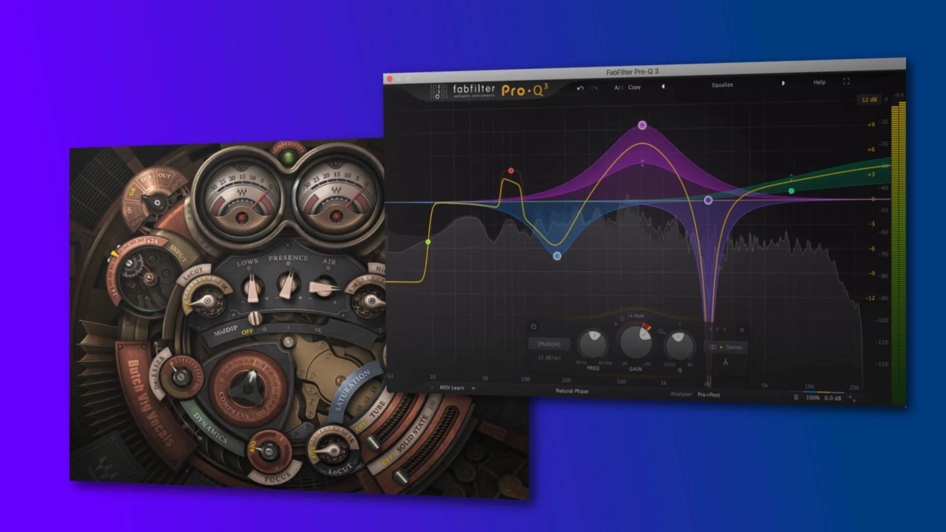
There are lots of bad plugin interfaces around, these are typically examples of a plugin trying to look attention-grabbing at the expense of usability. I’m going to call out Waves’ Butch Vig Vocals here (see the hero image at the top). Unique, but way too busy for my taste. I understand why skeuomorphic designs stick rigorously to the design of the hardware, but how successful that is ultimately depends on the hardware. Renderings of non-illuminated buttons can be hard to read and dual-concentric pots as found on vintage Neve and API gear is just irritating in a GUI, but it has to be there is you’re being authentic!
What Really Matters In a Plugin UI?
But instead of concentrating on how it looks, instead I’ll concentrate on how the UI influences how a plugin is used. After all, the best sounding plugin only sounds good if you make good decisions while using it.
Resizable UI
Resizable UIs are becoming the norm, particularly as so much of the back catalogue has been revisited in the last few years to update it to be natively compatible with Apple Silicon. A UI which is too small is annoying but one which is too big I find worse. While there are lots of examples I could mention one which springs to mind is the situation until a couple of years ago where the discrepancy between the huge UAD Distressor UI and the tiny UAD DBX 160 UI was enormous. Thankfully this has since been addressed!
The reason I think it matters is that, in the same way as it’s important to mix in context, not to mix in solo, the same apples to plugins. If you look at a rack of outboard you can see all of it, you might adjust one at a time but you can see all of them. Excessively large plugins make this difficult and the option to adjust the window size makes building window configurations much more flexible.
Being Able To Dial Back The Information
Being able to customise the UI so that only the information you choose to see is visible is a big plus for me. I like to have access to a spectrum analyser, but I also really like to be able to hide it. Some of my most used plugins have extremely customisable interfaces as unlike hardware, displaying a control in software is a choice. Excellent examples are the compact display mode in FabFilter’s C2 or Ears Only mode in Sonnox’s Oxford EQ which hides the EQ curve graph
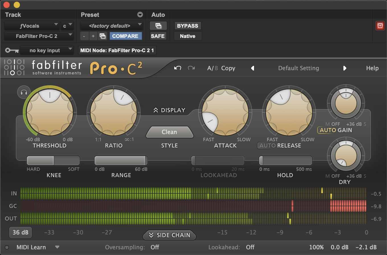
A More Compact FabFilter C2
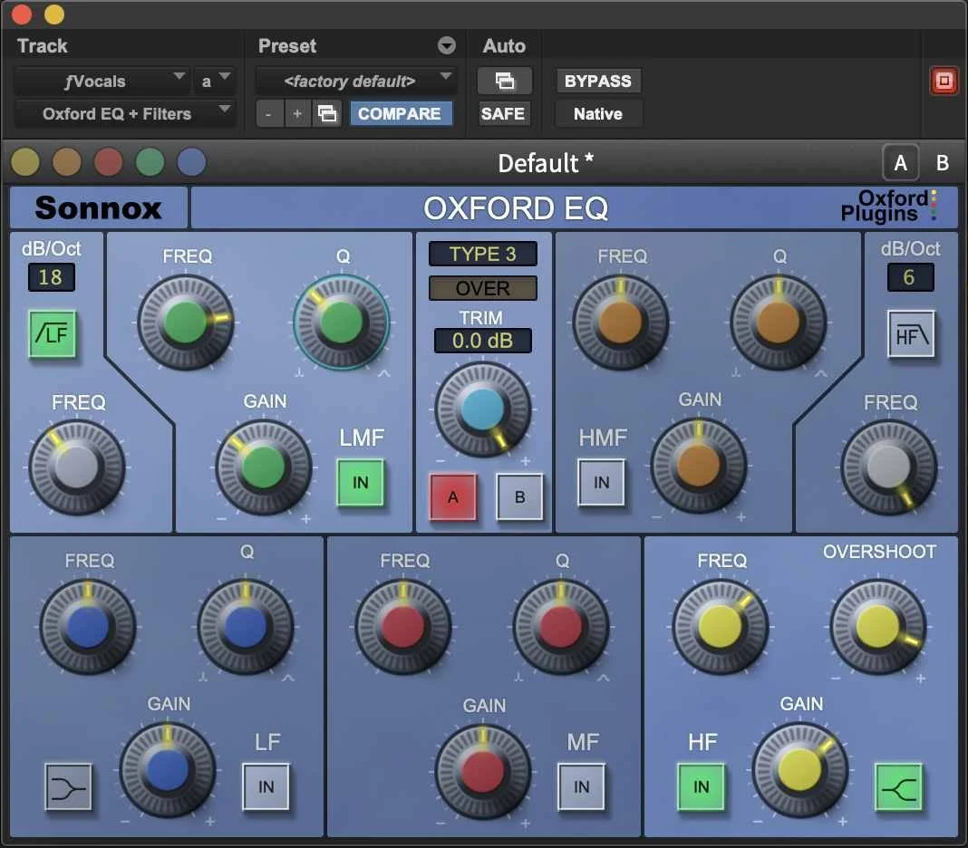
Oxford EQ - Ears Only Mode
Conveying What Processing Means In The Real World
Rich visual feedback is one thing but unless it tells you something useful, it’s just pretty pictures. A good example of this is a spectrum analyser which is too latent to display its information in a way which relates accurately to what you are hearing. Another way plugins can help to convey useful information is to display a piano keyboard along with frequencies in EQ windows, it’s easy to disassociate Hz from musical pitch despite them being different ways of saying the same thing. Fast peak meters are useful but a more relaxed ballistic can be really helpful for linking what is happening to how it sounds particularly in gain reduction meters.
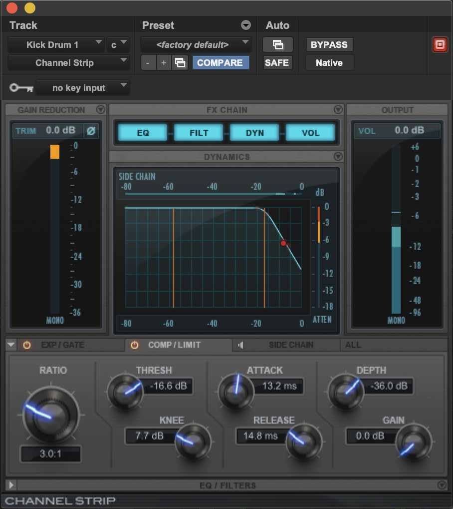
The two Gain Reduction meters in Channel Strip have different behaviours
If you’re a Pro Tools user try displaying attenuation rather than input level in Avid Channel Strip, the gain reduction there is averaged rather than the fast peak display which is next to the graph. Or choose a plugin with a good virtual VU meter. On the subject of gain reduction, gain reduction history plots can be incredibly useful for understanding attack and release behaviours, I think these are one of the most significant ways plugins are demonstrably better than their hardware counterparts.
Inter-Plugin Communication
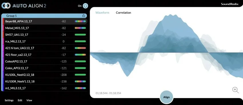
Lastly I’ll mention inter-plugin communication. The ability for plugins to share data between instantiations of themselves can be incredibly useful and use of heat map type displays in plugins like the updated Auto Align 2 from Sound Radix with shows correlation between tracks. This approach is also useful for showing potential buildups of energy between tracks in the frequency domain, identifying potential clashes and masking. Information of this type guides and informs choices, which is far more likely to make a tangible difference to mixes that any marginal or even totally subjective differences in sound between competing plugins and if you want to make better mixes, that has to start with better choices doesn’t it?
What plugin UI features do you think improve your mix decisions?